PORTFOLIO SELECTION - APRIL
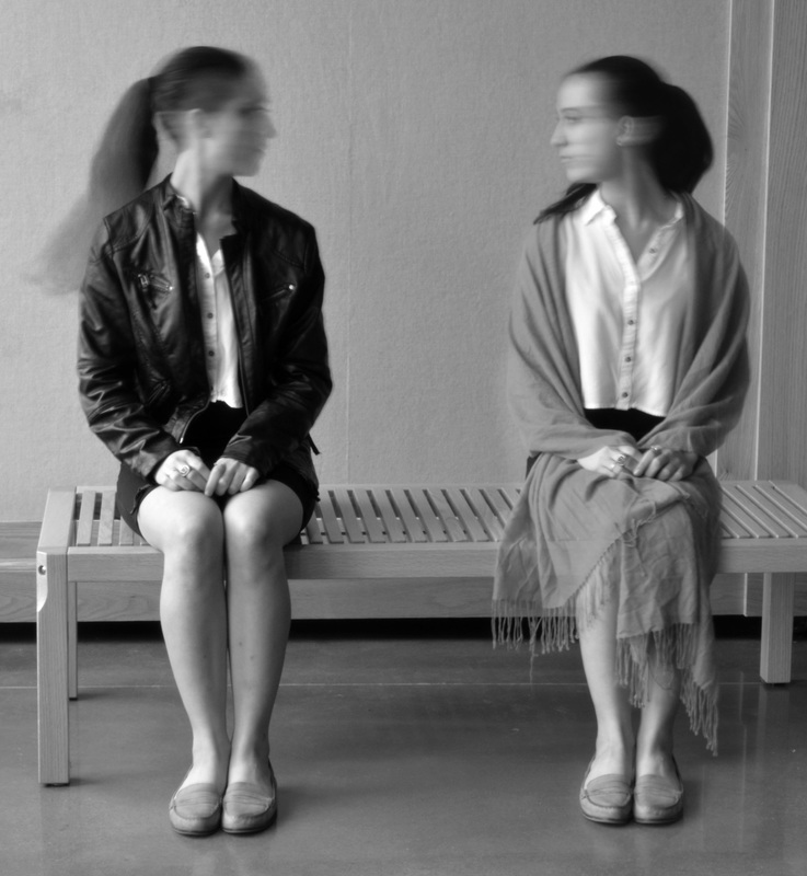
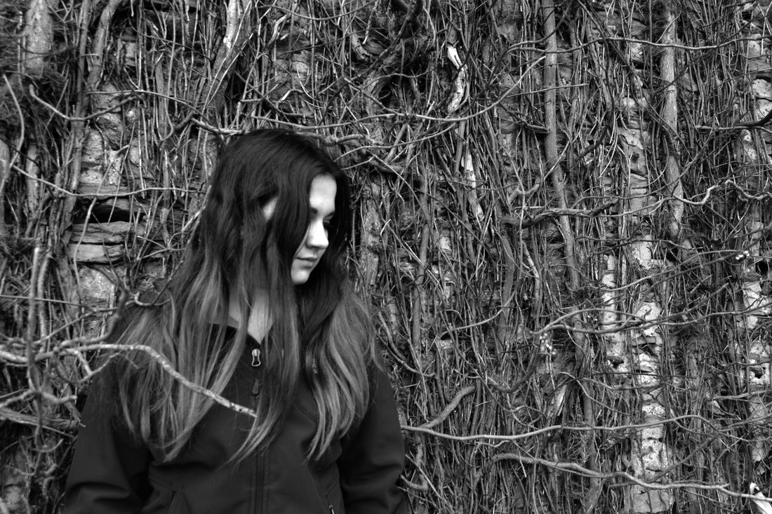
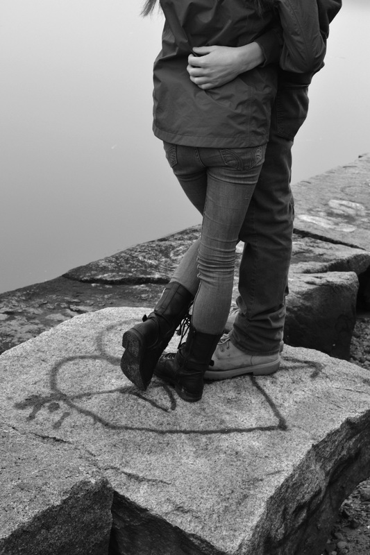
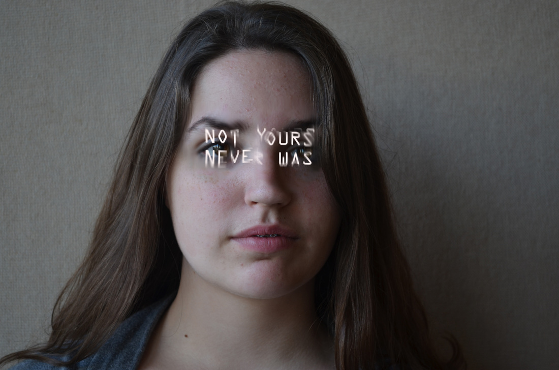
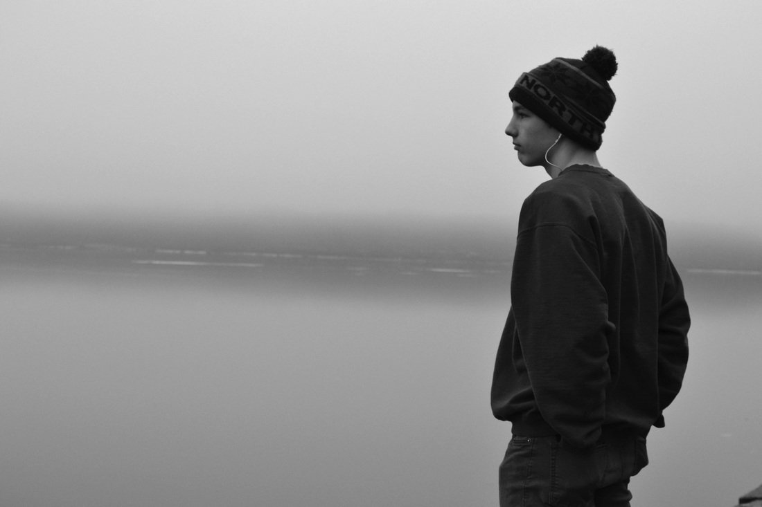
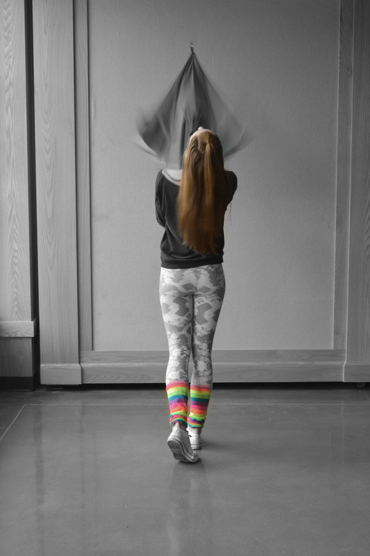
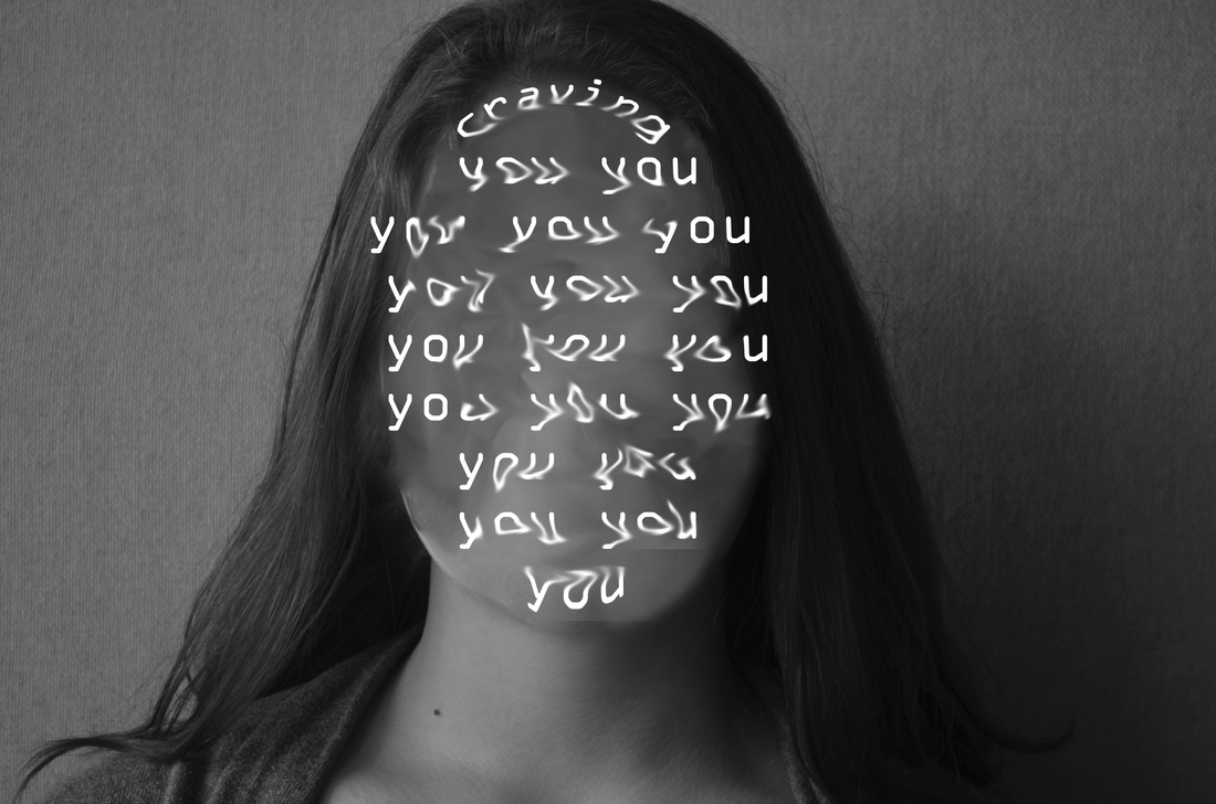
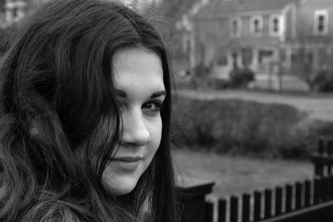
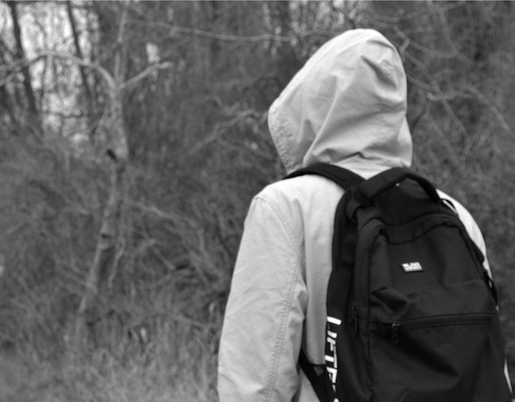
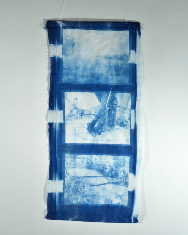
PHOTO 1
This image is part of my portfolio this year because of the uniqueness of it. It's composition is designed to draw you in, with positive and negative space between the two figures and repetition represented by the figures themselves. I chose to keep the image in a black and white setting, as it unifies the two figures even more. Proper exposure and contrast keeps the image from growing grey and losing a viewers interest. I decided to place myself in this image more than once for the artistic quality of it. I feel that it gives the photo an edge of confusion, as the viewer looks back and forth between the two, feeling that theyre seeing double.
PHOTO 2
This photograph was taken for the Envisioning Somerset project. The subject matter, Brooke, is standing against a vine covered wall. I turned this photo into a black and white image, to keep from the warring colors of the original to become distracting to the eye. I wanted the viewer to follow the leading lines of the vines and branches and allow their eyes to wander across the photo. I aimed my focus on Brooke, so as to establish her as the subject and leave the rest of the photo to lead the viewer throughout it. I was trying to convey emotion, keeping it black and white and photographing a beautiful young girl, who conveys a sense of loss.
PHOTO 3
My third image is once again a part of the Envisioning Somerset project. Two of my good friends and an adorable couple were standing together by the water. I seized the moment and captured the image. I love the way the negative space in the image seems to tangle with their legs. I also positioned just their legs in the photograph, so they created leading lines that move your eyes through the image. The contrast in this image was important to get right, that way the water and the couple didnt seem to mold and blend together. I chose them as a subject matter because as a couple, they are able to convey emotions like trust, comfort, and infatuation.
PHOTO 4
The fourth image was part of the disguise series. Bella, one of my favorite models to photograph, stood for these portraits. I kept Bella in the center, with negative space all around her. As from the technical point of view, I kept Bella in color. This allowed viewers to see the beauty in Bella's face and eyes. I kept Bella in color for artistic reasons as well, as the ability to see the color in her eyes allows you to better capture the emotion she is conveying. I used text to create a disguise, as if Bella was hiding behind her words and her statements. I blurred the edges of the text to give it an edge of mystery and desperation.
PHOTO 5
This black and white image of my friend Phil was taken by the water during the field trip. I set Phil on the edge of the photograph, so as to give the sense that the viewer is looking out over the water along with him. It gives a sense of distance and memory to the image. I kept the contrast in check, so that the water and Phil felt separated from each other and the grey wasnt overwhelming. Once again, I chose to photograph Phil with this emotion evident on his expression. The viewer is eager to discover Phil's thoughts when catching a glimpse of the image.
PHOTO 6
This photo of my classmate Emma was taken for the shutter speed assignment. I gave this image a unique composition, changing it into black and white and then erasing so as to bring back some of the color into the image. This draws you into these points on the subject and adds a bit of personality. I wanted to keep the image bright and eliminate most shadow, so I photographed Emma in the gallery where there is a lot of natural light. By adding the bits of color into the black and white image, a bit of character was added, as if the viewer was glimpsing a bit of Emma they never saw before.
PHOTO 7
Another image of Bella posing for the Disguise series has found its way into my portfolio. Again I changed this one to black and white, as I feel it better captures emotion and keeps good contrast between the image and the text. This is another image that seems to be more artistic than anything else. Although you cant see Bella's face, the words smeared across it are supposed to represent what she's feeling and is her disguise. I once again blurred the text so as to make this seem like a desperate and haphazard thought, or maybe one that is thought about time and time again and has become smudged, like ink on paper. I like to leave this open to the interpretation of the viewer.
PHOTO 8
Another favorite from Envisioning Somerset, a portrait of Brooke is in black and white. Keeping her closer to the camera than in most of my portraits, I composed the photo so it would seem as if you were looking and standing near her. The depth of field was important, as it kept Brooke's face in focus and the background in a blur. The emotion, a kind of contentment or shyness, on Brooke's face was well captured in this photograph.
PHOTO 9
Denver is pictured in this photograph from the Envisioning Somerset series. He has his back to me which makes the viewer wonder who the subject is, what they look like, and what they might be hiding. There is a balance of negative and positive space in the photo, drawing your eye to Denver's figure. The contrast is also strong in this image. The way the image was taken gives a sense of uncertainty.
PHOTO 10
This is the cyanotype we did for Impressionist photography. I chose three photos that followed a similar theme: aquatic tragedy. I chose these three because they had a good balance of positive and negative space which works well with cyanotypes. The subject matter tells a story with the photos and look almost exotic because of the colors on the fabric.
